
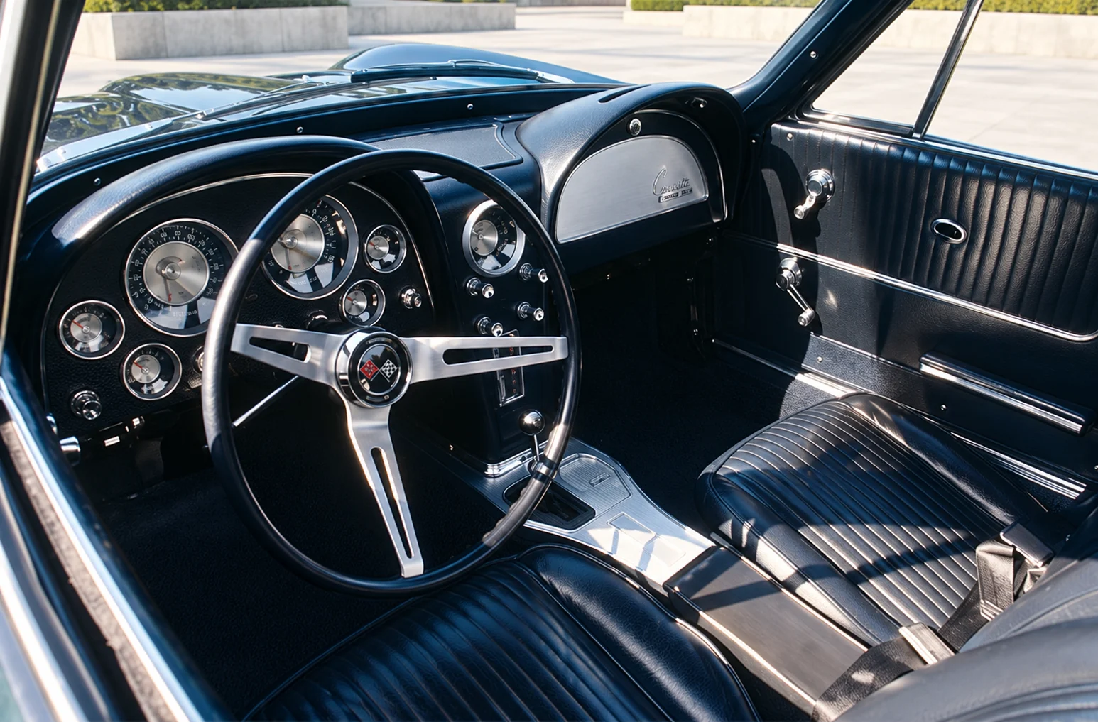
A 1960s dashboard can be compelling before the engine starts. Separate instruments, a thin steering wheel and a sculpted passenger-side panel make the controls part of the cabin's architecture. The appeal is real, but nostalgia often expands it into claims the actual cars cannot support.
The 1963 Chevrolet Corvette offers a specific starting point. Its factory interior photograph shows a pronounced dual-cowl arrangement: the instruments gather around the driver, while the passenger side has a related form of its own. The steering wheel, individual dials and center controls create visible layers instead of one uninterrupted digital surface.
Look at the layout before romanticizing the materials
This example is more useful than saying all dashboards of the decade were hand-crafted from wood and leather. The cars belonged to different price classes, manufacturers and production systems. A material claim needs evidence for the particular vehicle, not an impression borrowed from another brand's luxury interior.
There is also a difference between how a surface looks and how it was made. Texture, bright trim and upholstery can imply richness without identifying their underlying materials. Photographs support observations about visible shape and arrangement; they do not automatically establish composition or construction.
Physical controls have to work as an arrangement
The Corvette's cockpit gives each instrument a visible place. That separation helps explain its appeal: a control has a location, a shape and a relationship to the driver's hand. It is an appealing design idea, rather than evidence that every task is easier than in a modern car.
Usability still depends on legibility, reach, grouping and the situation in which a control is used. A beautiful dial may be hard to read in poor light. A clearly identifiable switch may sit awkwardly behind another control. A tactile interface deserves close examination rather than an automatic victory over a screen.
The same standard applies to contemporary interiors. Compare the actual tasks: changing temperature, finding a route or reading a warning. A design argument becomes practical when it describes the task and the tradeoff instead of ranking whole decades by taste.
Safety belongs in the history
The decade was not outside the development of safety requirements. NHTSA's interpretation of the interior-impact standard notes its application to new passenger cars manufactured on or after January 1, 1968. A 1963 cockpit therefore belongs to an earlier point in that regulatory timeline.
That date does not tell us the crash performance of a specific surviving Corvette, and an illustration cannot supply the missing evidence. It does show why decorative forms should be discussed alongside occupant protection rather than as though safety began only after the decade ended.
What remains worth learning
The useful lesson is the attention given to arrangement: a driver's area that reads as a coherent place, controls that participate in the design and a passenger-side form that does more than fill space. Those qualities can be studied without demanding that modern cars copy the hardware.
The past is most instructive when its limits remain visible. A dashboard can deserve admiration for its shape while inviting a separate discussion about materials, operation and protection.
Sources & image references
Researched analysis, updated October 13, 2026. Manufacturer figures and catalog accounts are identified in the article.

Keep exploring